GUIDE ME
UX Research | Data Analysis | Concept Development | B2C SCAD
Guide me is a service app that assist the users to guide and aware them about any
potential virus/ threats in their area
Overview
The purpose of this project is to use design management methods to help users get the verified information and news related to pandemic Covid-19. To invent, adopt or adapt any ideas that can deliver accurate and verified information news related to the pandemic.
Thus Presenting, Guide Me, a service platform which assist the users to guide and aware them about any potential virus/ threats in their area, to helps them in buying the necessary products during the pandemic and can track them before coming to the stores nearby. This service overall helps flattening the curve.
Project timeline
10 Weeks
Team
2 UX Researcher
2 Industrial designers
Role
Product Strategy
UX Research
UX Design
Tools
Adobe XD
Photoshop
Keynote
Miro
Process
I choose double diamond process in this project, It helped me in Discovering: a deep dive into the problem we are trying to solve. Defining: synthesizing the information from the discovery phase into a problem definition. Develop: think up solutions to the problem. Deliver: pick the best solution and build that.

Define: Problem statement
During the chaos of this year (2020), we could observe how poorly prepared we are to face a pandemic like that of COVID-19. 88% us were not prepared for any services during pandemic emergency and 77% of false information are all around the social media platform . With the idea of safeguarding civilians and our families, 82% of the supermarkets ran out of supplies in a matter of days. 66% did not know how much food, supplies, or medicine are to be stored in their home during the global emergency.
Our opportunity was to create a meaningful solution that will provide verified information and create meaningful services for addressing pandemic diseases currently and in the future, so that people are accessing correct information: What’s working well to motivate behavior change, what isn’t working, and what feels missing out.
How might we use Design Thinking methodologies to flatten the covid-19 curve in our communities and how one can be prepared for future pandemics?
Secondary Research
Of the Millennials needs help in decision making during the pandemics. Who wants to be updated with the verified information
Of the people in United States reported exposure to the fake news on social media and messaging platform related to the global pandemic in 2020.
People has undoubtedly been a proliferation of fake news stories, driven in large part by the public itself. False information circulating online has included claims around potential cures for COVID-19, origins of the outbreak, and authorities’ responses to the pandemic.
Of the medical community played a role in making the situation more confusing by giving, in some cases, inaccurate and sometimes contradictory indications on COVID-19.
Secondary research takeaways
User Research methodology
Survey results
77%
Believes that they need a verified and trustful Information related to Covid-19
91%
People don’t believe in the social-media news
82%
People would like to see their situation in their area
71%
Would like to know daily updated from their local mayor in their city
In-depth interviews
Affinity mapping
An affinity map was created with quotations from the interviews to look for patterns and gain deeper insights into the target audiences. This research created various visual models, including best quotes cloud, an affinity map, empathy maps, and personas which served to organize and re-structure the research data
Personas
User Journey
Final concepts & Insights
Concept evaluation & Ratings
To decide which solution was the most feasible in terms of technology, usability, and value I analyzed each solution with the help of a diagram. I gave a score and then I combined them. After analyzing the diagrams I discussed them with the team and compared them to find opportunities for our final solution. Disaster awareness and pandemic prep were among the top, so merging them was the one that showed more opportunities to succeed. In order to gain quick success I decided to collaborate with WHO, CDC & Local Savannah news for news information and latest updates.
Designing features for community & Awareness
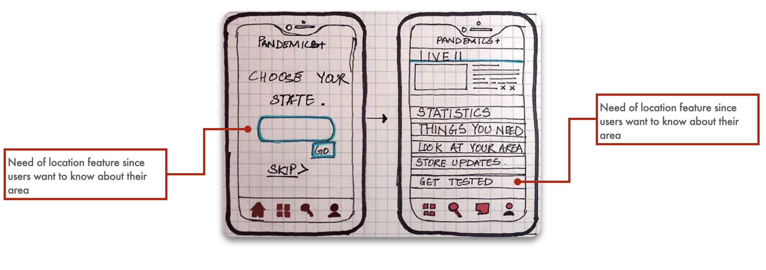
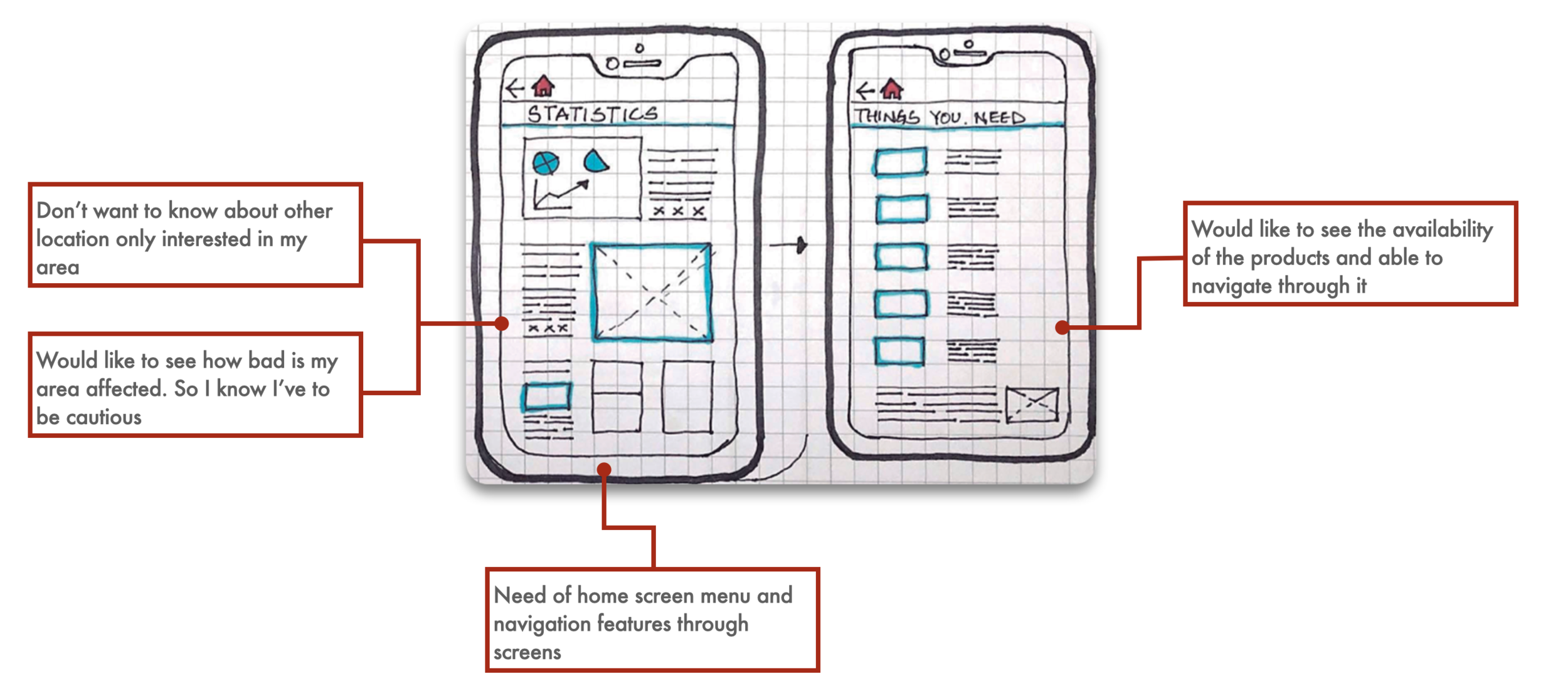
I started with sketches to visualize how our finals solution/ services will look and work-out. I worked on the main features for the add on service. The main features of the solution was to connect the users with authentic & latest news. To update the area of Savannah with potential threats in their neighborhood. To let people know about their symptoms and possible isolation places nearby their area.
Key features in my service
ALERTS
“Would like to see the transition in their internal systems and raise empathy within the stakeholders”
“Would want to be alert about the danger situation near my area”
COMMUNITY
“I would like to know more about my area and what all precautions I can take”
AWARENESS
“I would like to know about the emergency supplies and be prepared about the future”
Paper prototyping and User feedback
Information Architecture
After paper prototype feedback, I analyzed feedback and designed the user flow which help me structure the information for an easy and smooth navigation
Low-fidelity prototyping
Brand identity
Storyboarding
Home Screen
Users are given a top priority to give a call to helpline emergency. On the main screen the users can use the services like news, get to know about their symptoms, and can access their live area details about the covid-19 spread.
Hello Cathy,
When Cathy open her app, live update about her area will pop up and this will let her know about the situation without going further in the application
Look at your area
It assists the users like Cathy, who wants know about her area and what are the conditions in her locality. It helps users to be more cautious and aware about themselves.
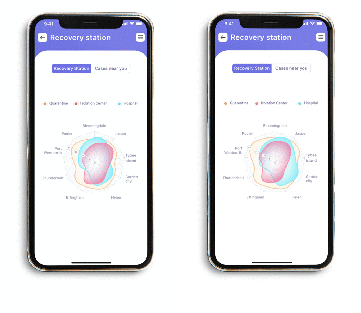
Recovery Station
Helps you assist with the local Quarantine stations, Incubation centers and Hospitals that are available in the near by Savannah region.
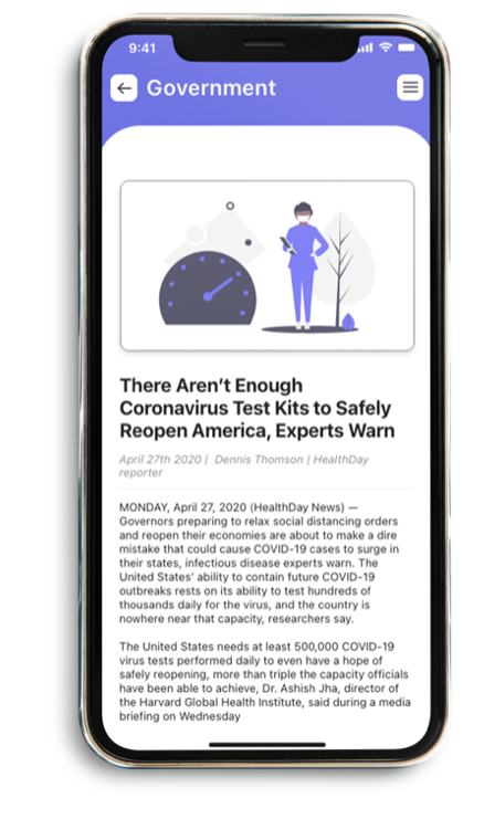
News
The reason for adding this section was for users to know about the live situation of pandemic. To get the verified information from the health Organizations itself.
W.H.O
We partnered with W.H.O to give the best verified information so users don’t have to always check other sources
CDC
CDC is nations health protection agency. Partnering with them so one can learn about the safety, concerns and get to know the latest guidelines to follow
Local
Connecting locals with the mayors, so one can check their status of their area and know about the health officials and their dedicated help
Symptoms
This lets the users know about the symptoms related to the pandemic or diseases. It also helps the person to take a test of any ongoing virus and helps you decide the next steps like; request for a test, or get online consulting.

My learnings & takeaways
Always Validate Assumptions: We initiated the project with a certain hypothesis about why people don’t want to follow any social-media news during the pandemic and news related to it. I am so relieved that I did primary research because the real problems were different. The solution people appreciated the most was not the solution we had expected to have a chance.


